
Best Colour Combinations for Modern Luxury Homes in 2027
Luxury interiors are no longer just about appearing expensive; by 2027 modern luxury is expected to place greater emphasis on warmth, individuality, natural materials, sophisticated neutral tones and thoughtfully chosen statement colours.
The way in which luxury is now being approached involves making a home that seems calm, elegant, comfortable and deeply personal rather than one that is excessively decorated.
Colour will be of great importance in determining the character of luxury homes in 2027, ranging from warm, earthy neutrals and rich browns through to muted greens, sophisticated blues and soft metallic accents.
Why Colour Will Matter in Luxury Interiors in 2027
A successful luxury interior isn't the result of using expensive materials throughout. Instead, it is achieved through establishing harmony between:
Colour
Lighting
Furniture
Textures
Architectural elements
Natural materials
Proportions
In 2027 homeowners are becoming more interested in interiors which have a personal, timeless and comfortable feel rather than in those which are designed simply to make an impression.
A simple formula to begin with is:
Base Colour + Secondary Colour + Accent Colour
For example:
Warm Ivory + Walnut + Olive Green
It adds depth at the same time as maintaining the general atmosphere as sophisticated.
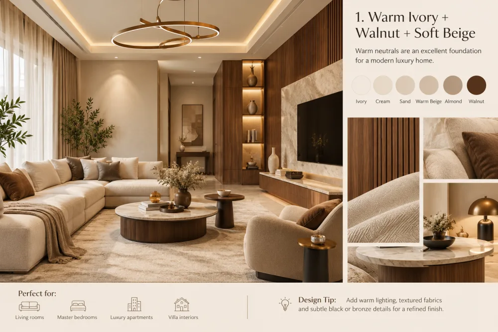
1. Warm Ivory, Walnut, and Soft Beige
Warm neutral colours make an excellent base for a modern luxury home.
Instead of stark white, consider warmer shades such as:
Ivory
Cream
Sand
Warm beige
Almond
Add walnut furniture or wall panelling to create a sense of depth.
Perfect for:
Living rooms
Master bedrooms
Luxury apartments
Villa interiors
To give it a refined look, add some warm lighting, use textured fabrics and include a few subtle black or bronze details.
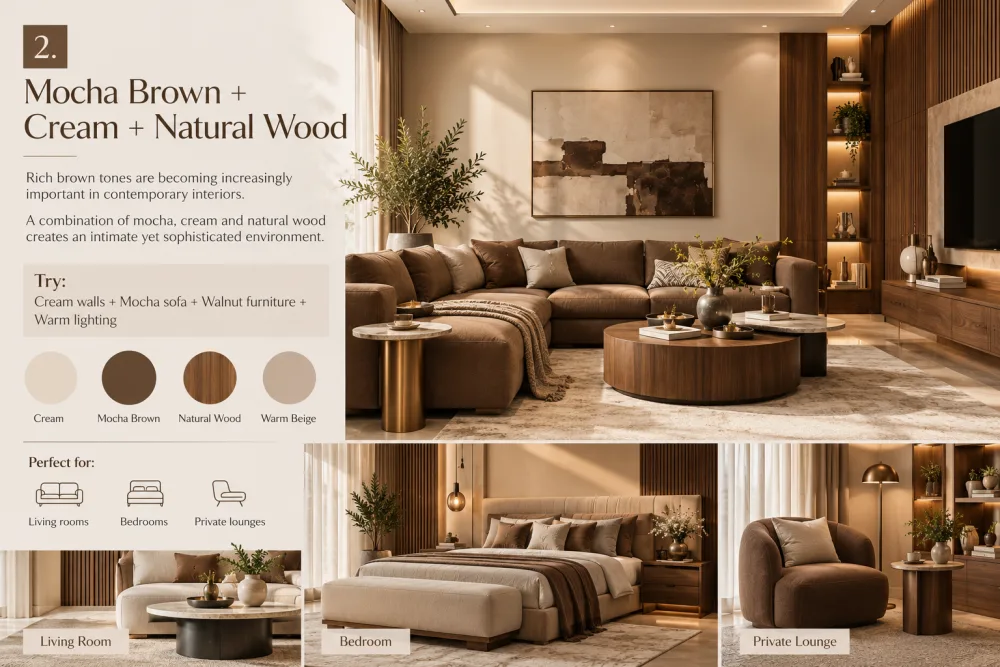
2. Mocha Brown mixed with Cream and Natural Wood
Brown shades are growing in importance in modern interior designs.
The atmosphere is both intimate and sophisticated because it combines mocha, cream and natural wood.
Try:
Cream walls + Mocha sofa + Walnut furniture + Warm lighting
It is especially suitable for use in living rooms, bedrooms and private lounges.
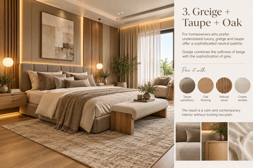
3. Greige, Taupe, and Oak
For those homeowners who favour a simple kind of luxury, greige and taupe provide a refined range of neutral colours.
Greige brings together the softness of beige and the sophistication of grey.
Pair it with:
Taupe upholstery
Oak flooring
Natural wood
Cream textiles
The effect is an interior that is both calm and modern without appearing too simple.
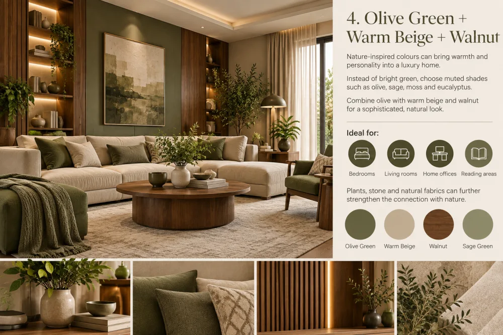
4. Olive Green, Warm Beige, Walnut
Colours that are inspired by nature can add a sense of warmth and character to a luxury home.
Instead of bright green, choose muted shades such as:
Olive
Sage
Moss
Eucalyptus
A sophisticated, natural appearance can be achieved by combining olive with warm beige and walnut.
Ideal for:
Bedrooms
Living rooms
Home offices
Reading areas
Plants, stone and natural fabrics can also help to strengthen the connection with nature.
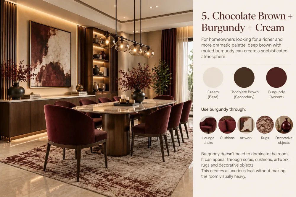
5. Chocolate brown together with burgundy and cream
For homeowners who want a more rich and dramatic colour scheme, a deep brown combined with a subdued burgundy can produce a sophisticated atmosphere.
Use:
The base is cream, the secondary colour is chocolate brown and the accent is burgundy.
Burgundy needn't dominate the room; it can instead make its presence felt by:
Lounge chairs
Cushions
Artwork
Rugs
Decorative objects
It gives the room a luxurious appearance without making it look bulky.
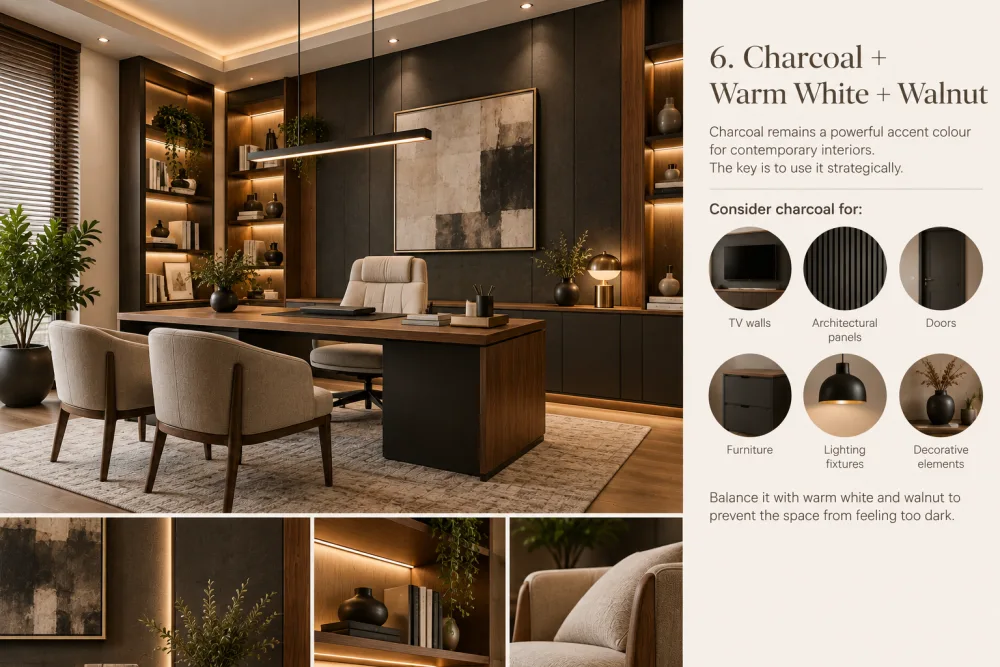
6. Charcoal combined with Warm White and Walnut
Charcoal continues to be a strong accent colour in modern interior design.
The best approach is to use it in a strategic way.
Consider charcoal for:
TV walls
Architectural panels
Doors
Furniture
Lighting fixtures
Decorative elements
To avoid the room from appearing too dark, combine warm white with walnut.
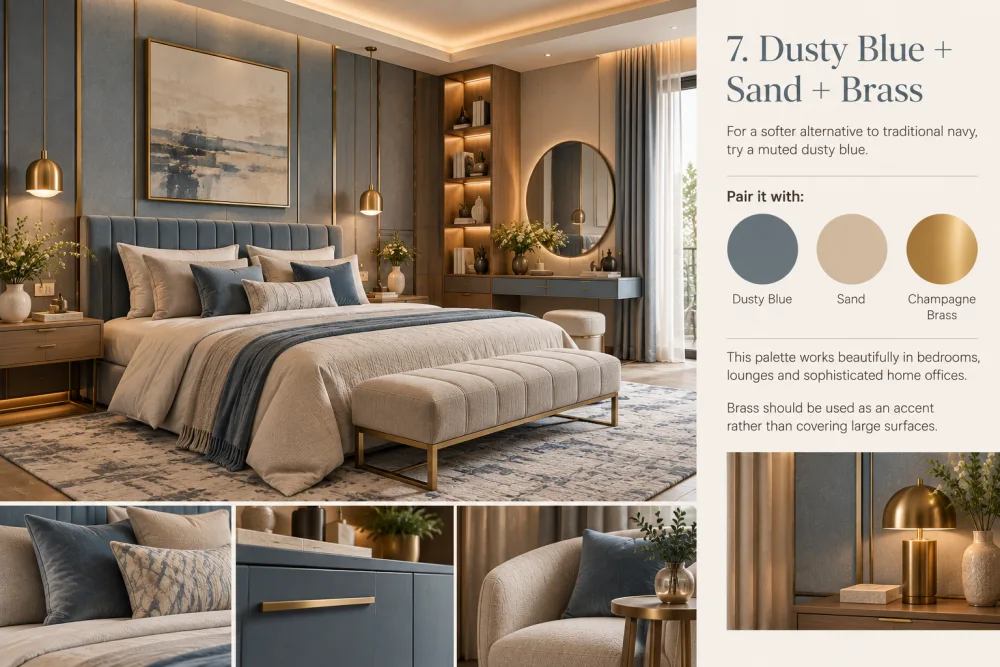
7. Dusty Blue mixed with Sand and Brass
As a less harsh option than traditional navy, you might choose a subdued dusty blue.
Pair it with:
Dusty Blue + Sand + Champagne Brass
It looks very good in bedrooms, lounges and in elegant home offices.
Brass is better suited to be used as an accent rather than for covering extensive areas.
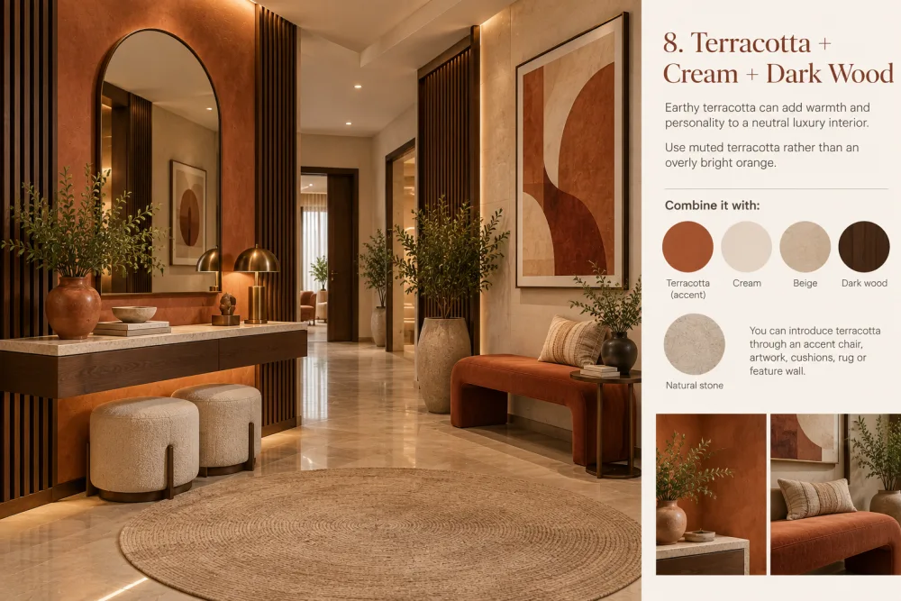
8. Terracotta with cream and dark wood
Terracotta with an earthy appearance can give a neutral luxury interior a sense of warmth and character.
Use a subdued terracotta instead of a rather bright orange.
Combine it with:
Cream
Beige
Dark wood
Natural stone
Terracotta can be introduced using an accent chair, some artwork, cushions, a rug or a feature wall.
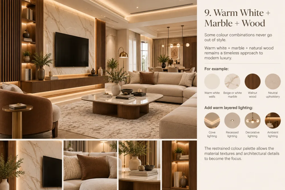
9. Warm white with marble and wood
Certain colour combinations are always in fashion.
A combination of warm white, marble, and natural wood is still a classic way of achieving modern luxury.
For example:
Warm white walls
Beige or white marble
Walnut TV panel
Neutral upholstery
Warm layered lighting
The fact that the colour scheme is restrained means that the material textures and the architectural details can be the focus.
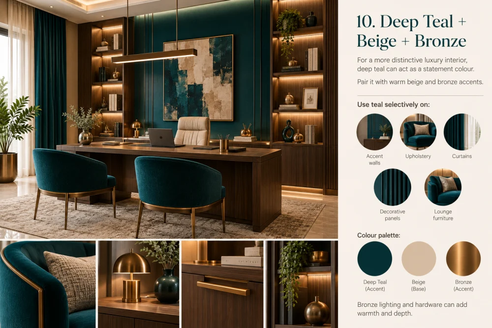
10. Deep Teal, Beige, and Bronze
Deep teal can be used as a statement colour if a more distinctive luxury interior is desired.
Complement it with warm beige and bronze accents.
Use teal selectively on:
Accent walls
Upholstery
Curtains
Decorative panels
Lounge furniture
Bronze light fittings and hardware can add a sense of warmth and depth.

How to Select the Right Colour Palette for Your Luxury Home
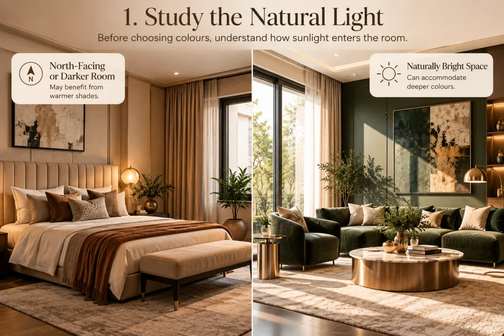
1. Study the natural light.
Before you select the colours, make sure you know how sunlight gets into the room.
In a room that faces north or is darker, warmer tones may be beneficial, while a space that receives natural light can have deeper colours.
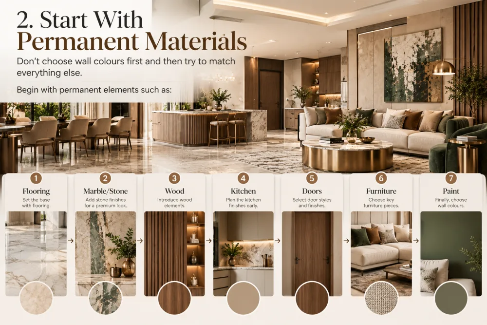
2. Begin with materials that are permanent.
It is better not to select the wall colours first and then attempt to match all the other elements.
Begin with permanent elements such as:
Flooring → Marble/Stone → Wood → Kitchen → Doors → Furniture → Paint
This results in a more coordinated interior.
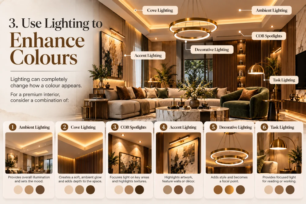
3. Use lighting to enhance the colours.
The way a colour appears can be entirely altered by the use of lighting.
For a premium interior, consider a combination of:
Ambient lighting
Cove lighting
COB spotlights
Accent lighting
Decorative lighting
Task lighting
Lighting that is warm can especially bring out the qualities of wood, beige, brown and earthy tones.
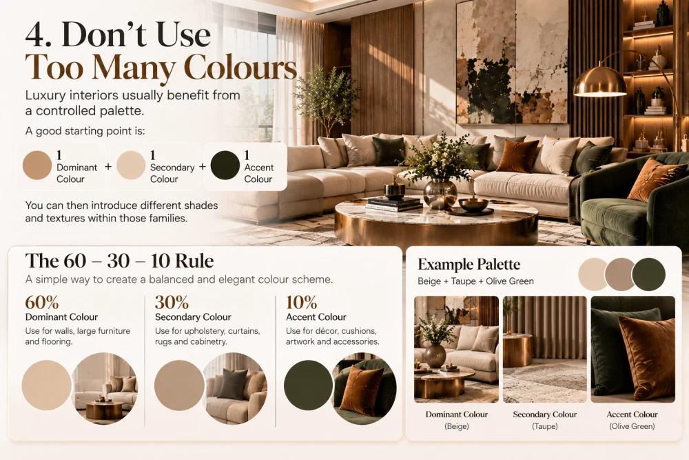
4. Avoid using too many colours.
Interiors of a luxury kind generally have the advantage of a restricted colour scheme.
A good starting point is:
1 dominant colour + 1 secondary colour + 1 accent colour
You can then bring in various shades and textures from within those families.
The 60–30–10 Rule
A simple way to maintain colour balance is:
60% — Dominant Colour
The walls, the ceilings and the large surfaces.
30% — Secondary Colour
Furniture, floor covering, curtains and the cabinetry.
10% — Accent Colour
Artwork, cushions, lighting, décor, and smaller details.
For example:
60% Warm Ivory + 30% Walnut + 10% Olive Green
The outcome seems well-coordinated yet doesn't grow boring.
What gives a colour scheme a luxurious appearance?
It doesn't have to be the colour itself.
The sophisticated appearance is generally the result of the way the colours are combined with the materials, the proportions, and the lighting.
For example:
Warm beige + walnut + textured fabric + marble + soft lighting
Can appear a great deal more luxurious than employing a number of costly finishes without having a consistent palette.
In 2027, think:
Less visual clutter.
More texture.
Warmer colours.
Natural materials.
Better lighting.
More personality.
Colours to Watch in 2027
For modern luxury interiors, consider exploring:
Warm ivory
Soft beige
Greige
Taupe
Mocha
Chocolate brown
Walnut
Olive green
Sage
Dusty blue
Deep teal
Muted terracotta
Burgundy
Charcoal
Champagne
Soft bronze
What you don't need to do is to use all of them; instead, select a colour scheme that matches the architecture and personality of the house.
Final Thoughts
The idea of what constitutes luxury interior design is evolving. By 2027 luxury will be less concerned with filling a house with costly finishes and more focused on achieving a well-balanced, comfortable and carefully designed atmosphere.
A suitable colour scheme can make a room seem bigger, warmer and more refined at the same time as enabling materials like marble, wood, stone, metal and fabrics to work together naturally.
Whenever you are designing a modern apartment, a luxury villa, a penthouse or a contemporary house, formulate a solid colour scheme first and then design the rest of the interior to go with it.
At New Arch Studios, we approach colour as part of the complete design language of a space—integrating architecture, furniture, materials, textures